These necklaces are crafted with the intention to create a personal and meaningful connection for you and to ground you in that intention.
I’ve just posted whole new bunch of necklaces with their stories. The stories and poems are thought-juice and reflection. If you like the idea of wearing an idea, take a look at this video where I’ve highlighted some of the new poems… I mean paintings.
Need Color?
These necklaces are perfect pop of color and sparkle that grab attention.
A Great Value
All necklaces are just $45. They come with the story, a cord or chain and certificate of authenticity and are packaged to perfection.
New Watercolor NecklacesNew Watercolor NecklacesNew Watercolor NecklacesNew Watercolor Necklaces
One of a Kind Gifts
I spent time considering the packaging for the necklaces and decided the necklace cards were best. You can slip them into a card and envelope easily and they easily showcase the poems and stories written for each one. These stories are often the reason people gift them to their loved ones.
Corazon Watercolor Necklace
You Look Good – As Usual
What it really comes down to is how they look on you. And that, my friend, is the best part.
After five workshops mentoring 43 mostly-beginner watercolorists create stunning pendants, I’ve learned some things about people and watercolor and I’m excited to share this with you. First, this workshop did not turn out the way I expected which is a good thing because unpredictability is the nature of adventure. And I love a little adventure.
Just like people watercolors are:
Temperamental
Require patience
Distinctly individual
Absolutely stunning, surprising potential just waiting to break through with the help of a soft touch and guidance.
My initial reaction to being asked to teach this project was “Oh my god No! It’s too hard, watercolor is too hard and I don’t know anything. It’s too much pressure. People won’t succeed. I’m not the right mentor or teacher for this job.”
What a bunch of fear-based self-deprecating BS designed to keep me from moving forward. Not one word of this is true. BUT here are some real truths about this workshop:
Truth #1: Watercolor Necklaces are an Excellent Beginner Project.
Why? This project is a low risk, high success and reward activity. Artists can work on larger sized paper and make and experiment with many different colors and techniques. Not every composition needs to be perfect because out of a 8″ x 10″ sheet only one 1/2″ x 1 1/2 pendant necklace will be made. This gives everyone a lot of room to play, learn and even get a little frustrated. Through this process participants develop a vision as they work, they don’t need to know everything beforehand.
Take a look at my example below. The first picture is of the paintings I did for possible pendants, there are 7 original paintings. Notice that they are all larger than the final pendants and overall not very attracitve. I didn’t like one of them so I up with 6.
small paintings framed in pendants.
Here you can see the final pendants that came from some relatively messy watercolor doodles. At just a slice of the original, they are the most successful compositions and no one has to know where they came from.
Final pendants
With so many chances to create something you like, you will create something you like. It’s inevitable.
Truth #2: Participants Learn Fundamental Art Concepts of Color and Composition in a Hands-on Safe and Experimental Environment.
After a couple hours of play and experiment, artists work on re-composing mini-paintings into jewelry. Participants quickly learn success lies in composition. Composition is the organization of elements in an artwork and is the difference between love and repulsion. Many of us understand it instinctively. Unlike working with canvas, this project allows you to play and then perfect the composition at the end. There is no need to know exactly what you are doing when you start. With the use of viewfinders artists can frame just the right one and hide any mistakes by not including them. Success lays in finding the right color combination for you and framing the composition the way that you like it.
Various compositions can be made from one small painting.
Truth #3. Participants Learn to Let Go of Negativity and Flow.
Low risk and high success creates an environment rich for play. The Pendants are a mini-exercise in learning to let go and to follow or partner with watercolor.
This is a balance between not just letting go but also learning to think with both an analytical and playful mind. When we analyze we learn, assess, adjust and think. When we play; we paint, let go, feel gratitude, smile, laugh and have fun. The place between these two is balance and a state of flow, time stands still and we enjoy ourselves, learn and problems solve, and act. Flow feels good and it is good for you.
learn, paint, assess, play, adjust, explore
Common Problems with Watercolor
Like anything, common beginner problems have emerged across the workshops too. After some experimenting, I have some advice for artists struggling with them too.
Problem #1: Too Much Paint
To Much Paint (Hooker’s Green)
This looks like super saturated color, very vivid as it goes down but completely unworkable, dark and inky afterwards. You can’t paint over it, the color is too thick no matter how hard you try. Why? Because watercolor is translucent, and any color you lay over too much paint will only turn out like mud or be slightly less than invisible. That thick color is there to stay and heavy with its presence.
Fear not! There is one fix. It is imperfect, but you can lift paint from the paper.
Here is How.
Take a clear wet brush and saturate the color with water
Lift the paint gently with paper towel, Q-tip or clean dry brush
Fixing too much paint!
Kind of like magic.
After I lifted the paint, I used more hooker green with a smaller brush, some gold and white gauche to highlight.
other solutions
There will always be a little ghost of color with the above solution. This might be ok. Of course the best way to fix something is to make sure it doesn’t happen at all.
Here are some tips to stop the problem before it starts.
Know Before you Paint. Test the brush and use the test paper before painting.
Balance your Value. You don’t want too much paint or water on your brush and you don’t want too little. Too much paint and the color is too dark. Too little and you will barely see it. To begin, go for a 40-60% value or saturation which is right in the middle of the lightest value and the darkest. With practice, you will get good at filling your brush with just the right amount of paint, but you have to practice.
Values in blue
Start with Less. Work from light to dark. Choose lighter colors first and lighter values and build layers of colors up to the value you want.
Big to Small. Work from big brush to smaller brush. Bigger brushes cover more ground but as you get closer to your goal, select different and smaller brushes to get to what you want.
Slow down and use your Imagination. Painting is as much about looking and thinking as it is about painting. Slow down, take a break, step back and look at what you are doing. Try to imagine what it will look like if you add more color and if you will like it.
Dab and push don’t stroke. Don’t use a brush stroke. Use a smaller brush and dab along the edges of the painting. This is particularly useful when the paper is a little damp and the watercolor can blend into the paper.
Problem #2: Too Little Paint
Not Enough Paint
This is sometimes a harder problem to define. The painting looks nice enough but isn’t quite right. Fear is taking over though and the artist is afraid they will mess it up. So she/he stops. But something isn’t quite right.
solutions
Self-Check. Slow down and think about how you are feeling. Match that with how you want to feel. Often times, fear keeps the painter from painting. Are you scared you are going to mess it up? Does it look just good enough? Check in and find your courage to explore. Often times, you can take good to awesome by working through this fear. Just swallow, assess and use your imagination! What do you think you could do to improve it?
Check the Value Contrast. Contrast is key to creating dramatic art and often times what looks kind of nice can be transformed by checking your variation in value. What is value? Value is best described by understanding color in shades, like gray scale, color can flow from a low percentage to saturated. The more variation you have in value, the more interesting the art, especially abstract art.
Value scale from white to black
Often times, people have a hard time seeing values in color. To get around this, try this simple trick. Take a photo of your work with your cell phone then change it to black and white. Immediately, you will see the variation in value regardless of hue.
In this example there is only value contrast in the dark yellow, the rest of the colors blend into each other with little variation. It looks like two yellow eyes in grey clouds.
Not enough paint in values
Go Small. This is a great way to add variation in value. Use a smaller brush and create more value contrast and details, follow the paint and look for how to enhance the drama.
Dab and push don’t stroke. Don’t use a brush stroke. Use a smaller brush and dab along the edges where colors transition or in areas you want to enhance. This is particularly useful when the paper is a little damp and the watercolor can blend into the paper.
Here is the finished painting from the original. I used the original swatch as a the background and played up the yellow but added a lot more contrast and depth in the high and low values. Can you see the difference in the variation of value from above?
Enough PaintEnough Paint in Grayscale
Problem #3: Creating Mud
Mud
I see problems 1 & 2 the most, but the top question people ask me is how do I work with the paint and not create mud. In this case, the paint seems to have a mind of its own and turns into a great swath of muddy gross non-descriptive color.
A little patience and knowledge of the color wheel helps do wonders for this problem.
The color wheel
The fundamental problem is that any two colors on opposite sides of the color wheel mixed together directly will produce a grey or brown of some kind. Honestly, if you like grey and brown sometimes the result is pure awesomeness. But often times it is inadvertent and frustrating.
According to the color wheel and put simply:
purple + yellow = mud
blue + orange = mud
red + green = mud
However, painting the colors next to each other are complementary and do look lovely together too. It is a dilemma.
My Jungle by Marika Reinke
Here are some solutions.
solutions
Slow down! Wait for them to dry before painting the another color next to or on top of them. A hairdryer comes in handy if you are in a hurry. You can also move onto your next painting while you wait for this one to dry. I did not paint red or orange into the painting above until I had laid most of my greens and yellows and they were dry.
Keep them separated. Paint the colors on opposite sides of the compositions and work towards each other until they are dry. In fact, some of my first paintings I didn’t let colors touch at all!
Develop good habits. All the solutions for problem number 1 apply here as well, practice those good painting habits and you will have some great results.
That my friends is my list of the top 3 reasons why, problems and solutions for you to try out this fun project. You can check out my workshop page for workshop dates and details or my resources page and try it out yourself.
Really, you don’t have to wear a necklace. Most of the time, why worry about it? It isn’t an essential and most of the time, they are for people that are into fashion trends and style magazines.
But a necklace isn’t always about style or trends. Instead, a necklace can be about inner beauty, strength, and courage.
There are times when self-expression is a necessary luxury and peace of mind, like settling the nerves of an upcoming public speaking engagement, garnering courage to ask for a promotion, vulnerable moments when a little pop of color brings much needed cheer, or a gentle reminder in troubled times that this too shall pass and is an opportunity to grow. There are times when a necklace expresses, grounds, reminds and protects you. And you deserve it.
A necklace can speak to and for you. Only you know when you look at it and say, “Yes, this is me! It is about me!”
That’s why I paint these watercolor necklaces; to connect you to the truth of you when you need it; everyday, some days or on special occasions.
Which One Expresses You: Watercolor Painting Necklace by Marika Reinke 2017
I paint them one by one
I start with pure intuition, inspiration and high quality watercolors then let these paintings emerge from the paintbrush and intention. The result is a unique little painting that sparkles like a jewel and tells a story that, I believe, will connect with just the right person. The essence of that story is captured with a short original poem that I write and deliver with each one.
Watercolor Paintings in Progress by Marika Reinke 2017
Believe me, I don’t finish a painting, unless I think it is perfect, even if it means waiting again for another dot to dry. When I reach that moment and I’m sure, I begin to frame them in glass, name and sign them, and seal them with a durable diamond glaze. The complete process can take 2-3 days with many settled moments waiting for paint, glaze and glue to dry in between.
The best part is when everyone comes together; a painting, a poem, a watercolor necklace find the perfect person who cherishes this piece of art as truest self-expression.
My bestselling watercolor necklaces are completely unique. No two are alike and no painting is ever copied. Once the perfect necklace is in its owner’s hands, that necklace has found its soul mate. If you think you’ve found yours, believe it. It was made for you.
My Guarantee
I offer a 100% money back guarantee, if you aren’t satisfied I will refund your money or exchange it for the right watercolor necklace for you.
These are beautiful one-of-a-kind original watercolor painting necklaces. They sparkle, a luscious punch of style, like jewels but crafted with iridescent, gold, silver and vivid luxurious pigments. Practically, they are durably sealed to outlast Costa Rican heat and water (please don't put them in the laundry though!). Ultimately, they are meaningful gifts that seal friendship, memories, love and self.
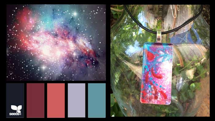
When I painted this, I based it off a picture of a galaxy I have pinned on my “Color Schemes” Pinterest board. I wanted pinks, rich purples, blues and some white blasts of light but not a literal translation of the photo. The final doesn’t look like the galaxy, it was never my intent to end there, only to start there.
As I worked on it, I added the white gouache to the wet colors and watched the white expand and speckle the painting. It was amazing. It looked almost exactly like the galaxy, but I didn’t do it, the water did it (I swear it!).
There is mystery everywhere but also order. I love chaos theory.
This necklace is a reminder that living in that mystery, accepting the chaotic order and creativity of the universe and being inspired and engaged there is a worthy life purpose.
This one has been sold. But I’ve listed a couple others left over from my Art in the Park debut on my Etsy shop for $40 plus free shipping.
CONTACT ME
I will collaborate with you to make a personalized custom pendant for $50. They are a great gift with a special message. I also personally make pendants from any of my paintings for $40. Send me a message for details.


You must be logged in to post a comment.