This Wise Little Slothhas taught me to follow my path, play in the soulful, pay attention to signs, have faith in my craft and always stay true to myself. This moment is almost always joyful. Leave space for joy, there is no use forcing it, it will come.
Are you looking for inspiration? A little down to earth reflection and renewal? Want to stay current on what’s new and what to expect from Marika? My emails are food for thought packaged with color, soul and humor.
Loss is felt as much as for what we have as for what we think we could have had. A wound and scar, internally, spiritually, emotionally. We carry on, even thrive, but the wound reverberates.
Watercolor 19″ x 19″
Original is Sold.
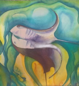
This painting was a commission. My client wanted me to paint the feeling of loss that comes from a wound unreconciled. Both visceral and emotional. A tight twinning of psychology and body.
Are you looking for inspiration? A little down to earth reflection and renewal? Want to stay current on what’s new and what to expect from Marika? My emails are food for thought packaged with color, soul and humor.
This commission is taking me a long time to finish. I make three decisions and then I’m exhausted, and the paint needs to dry. I walk away.
As I work, I think about my client. She has an irreversible and deadly disease. This painting is for her life partner as a parting gift, in memory of their life together. Their best memories are in the water, the mantas are metaphors and symbols.
Thrilling, intimate, scary, flowing, connecting …. fill in the rest here.
We all know life is finite. But it is another thing to know death is looming. It is another thing to be touched intimately by it and be asked to partake in the goodbyes.
I love her (my client). Every decision is a worth a million more than the thought that goes into it. I want to have all the time in the world to finish this painting. I want anything to slow down goodbyes. I never want this painting done so she can never give it to him. So she will never die.
So I slow down. And reflect on color and life.
The Birth story: color and life
Of the images she gave me, there were sea turtles, mantas, sea life, water, underwater corral. Of the words she gave me, mantas, moving together, light and colors, love and the stories she has shared with me about them.
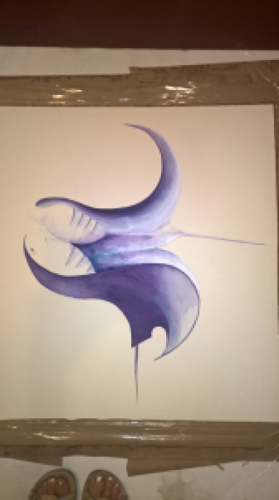
This image burned for me. This is sketched and painted on 9 x 12″.
Which eventually led to a rough idea and agreement.
I changed the mantas as little as I worked on the larger image which is about 26″ x 26″. They are purple; regal and spiritual. They come together in a more fluid shape. They merge so one is undecipherable from the other. The energize each other at the connection point.
And then I add background color. I also altered the color scheme a little, adding deeper blues and simplifying. The challenge is to keep the eye on the mantas while creating motion, energy, support and a story with color. A vivid purple draws the eye in just the right places, there should be color and contrast where meaning occurs.
The aquamarine frames the mantas. Dark colors keep the eye inward. The yellow draws the eyes to it and the mantas. Purple and yellow are complimentary colors, they glow next to each other.
Now I’m happy with the basic composition which is different than the first sketch. I took what worked from it and added and subtracted. Then, I return to the blues and yellows, softening, shading, darkening and adding depth.
This week, I came back to the mantas with more layers of colors and shading. The rewards for patience pay back huge in vibrancy and motion. The mantas are deeper purple now, the result is higher contrast which builds more energy and richness to the painting.
What is left?
I need to keep working the shading in the two mantas, their upper bodies are still a bit ill-defined and the background colors still need a few more layers for richness and just the right frame.
Mantas: A Love Story (c) Marika Reinke 2015 #WIP
She loves it. Believe me, she would tell me if she didn’t. I’m relieved and joyful. This project aches, but I’m so pleased that this painting is doing what she wants and needs it to do.
I could work on this forever.
She might have to tell me when to stop.
There is so much about this whole being human thing that I can find wanting. My imagination paints the ideal picture and nothing will measure up. It is after all, my imagination. And my perfectionism. And my idealism. Which are flip sides of criticism. It is easy to criticize. And sometimes criticism is good. It can make us better.
I’ve finally got this watercolor paper prepped to my standards, (my perfectionism) for my next commission.
The beginning, a blank sheet.
This next commission is not a perfect story. It is a completely wanting story and one that breaks my heart. Because we are human. Because we are mortal. Because in the end, we may not get everything we want out of this life. It doesn’t really all lay in our hands, there is fate and forces completely out of control. There is death.
And the most not perfect thing of all is love. There is Love. Love is not wanting. It just is. The act of appreciating Love in the face of nothing perfect is what this commission is about.
The trust placed in me in enormous.
It is teaching me to balance my perfectionism with pure and loving appreciation.
The Magic Tree painting starts with a couple of lively sisters, 5 and 8, that love to climb trees and a mom that loves everything these girls teach her. When the family had their kitchen remodeled they all decided they wanted a painting. And of course the girls insisted it had to be a tree.
I am honored to be recruited for the project.
I visited their house, took pictures of their kitchen, noted the colors, absorbed preferences and listened to mom talk about trees, her kids and climbing. The assignment was a tree. I honestly didn’t know what it would look like when I left. But I had some ideas.
I sat down to sketch them out. A magic tree emerged, with a climber, to capture those magical moments and memories the family will always have of their climbers.
Magic Tree Sketch
For reasons that can only be attributed to my manic painting behavior, I only had sketch paper available, all other boards were being used. When this sketch emerged on regular paper I knew it was what I wanted. I tried to paint over the sketch so that mom could get an idea of colors.
Painted Tree sketch
The colors are not what I intended. It is amazing how the colors just don’t match when painted on regular paper and you simply can’t work the color the same way to bring them out – the paper will disintegrate first.
Lesson learned: Always use watercolor paper when sketching an idea for a client.
Despite this, mom liked the composition, but not the colors. To clarify this key point before I started painting, I mocked up a color palette on watercolor paper and a detail of the painting to share with her.
color paletteDetail
I like the detail so much, I might just finish the painting soon, now that things are settling down.
With these three mock ups in place, mom was confident and gave me the go ahead to begin the 24″ x 18″ painting.
Mom let me post the progress on facebook and I kept her updated on progress. It took two weeks to finish, mostly because I was also trying to prep for my studio party. This painting would have taken about a week otherwise.
As I posted these on social media, there were some interesting comments about leaving the climber as a negative space, including from my husband. This posed the question as to whether I should paint the climber or not. I had deliberately left the climber to the end to make sure I got a good balance of shading and color for it.
I asked mom what she thought, and she debated, but we agreed to paint it.
I wanted to paint it. I’m keenly aware that as a painting emerges there is a fear of f**king it up when it is coming along so nicely. There is a balance in that space and it takes a lot of thinking, reasoning and faith to not let the fear control the artistic decisions. I knew some subtle shading would add depth, and made the climber look like a child-like symbol instead of a ghost (in my mind). But it was a difficult space to be in at the end of the painting. Mostly, I had to believe in myself and my vision, not always easy. Mom really believed in my instincts and I’m grateful for that.
In the end, I’m pleased. More importantly, the family is pleased. When they came to pick up the painting, both girls were sure the climber was them. Exactly. Don’t many of us identify with the climber? The parents commented how much better it looked in person (it really does).
And the painting looks even more amazing in the kitchen.
magic tree in kitchen
And my first run of prints is gone, a couple sold before I finished the painting and the last two sold at my studio party. A wonderful success.
If you would like to learn more about my commission process and prices, you can visit my Commissions & Services page for an overview or contact me directly.
Buy Here
Limited Edition customized prints (of 25) are now available for $65. Contact me directly for purchasing information.
This was my first thought when my husband suggested this project. I’ve done the graphic design thing. I worked at a firm at one point. I’ve taught design and related software. I really respect graphic designers. It’s a lot of work, talent, persistence, thought, completely artistic but highly client focused and much more technical and straight edged than I’d like my next career to be. I’m not a white space person, I struggle with white space. I’m walking away from a computer screen in favor of a paint brush for a reason.
But all those “I’m nots” is more a defense to keep me in one place. And they are full of assumptions. I’m not in a position to be closed-minded. Plus I generally don’t respect a closed mind.
So I looked into it.
This work in progress is for my husband’s climbing team t-shirt. He sold hiring me to his team, and his coach liked my work. They understand they are getting a paintbrush.
I originally sketched this out vertically. I started drawing with one idea and ended with another. This is my concept sketch.
The team liked it. But we all agree horizontal for a t-shirt is better. My husband doesn’t like pink (typical). They all prefer red, blue and green. The name of the team will be under it. I thought I would use a program for it, but maybe I’ll paint it now. I’m warming to the completely handmade idea.
I don’t usually sketch as heavily under my painting but I am real sensitive to getting those climbers right in relationship to the rocks. We are a climbing family, my husband and I have been climbing for over a dozen years and the kids with us. It won’t be right if they aren’t right.
It’s a small project, but fun to capture something we are all so dedicated to. And perhaps the fear of not getting it right is really why my initial reaction was full of “I’m Nots”.
This painting is inspired by a friendship and her vision. To know her, is to know someone embedded in a journey with peace, not just of her own but to those most suffering. And in her journey, her deep strength unseen, her soothing calm beneath the surface. She carefully tends to herself as she rushes to tend yours. Her ability to do this is awe-inspiring.


You must be logged in to post a comment.