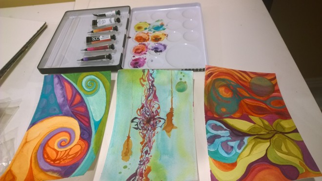
Confession: I am a color addict. I experience an artistic high when colors “make my eyes glow”. A shiver runs down my back, I get light headed, I feel tingly all over, I feel holy, (yes, spiritual) and inspired. My own paintings illustrate my addiction. Every. Single. Time. Color expresses me, I express color, my world is high definition color.
Of course, I was drawn to the professional QoR High Chroma set (good job marketing QoR). I’ve been using the QoR watercolors in silver and gold to offer hand embellishments for my limited edition prints. I’ve been impressed with the effect, they are true silver and gold and painting with them is like laying molten metal down. Additionally, QoR claims high quality, modern and superior color vividness. I’ve been using the widely regarded professional grade Winsor and Newton and Sennelier honey-based watercolors for years and years. They are top notch. The first time I laid down a professional watercolor, I felt like I the world cracked open as the color exploded on the paper. Oh the highest most radical color high! And my work exponentially improved.
Would it be possible to feel this way again?
Tip: If you want to pursue any kind of art, do not skimp on the quality of your paint or paper, simply don't do it. You will fail before you start.


The set has 6 colors:
- Cobalt Teal
- Green Gold – what an awesome name for a color
- Quinacridone Gold
- Transparent Pyrrole Orange
- Quinacridone Magenta
- Diaxazine Purple
In short, a vivid, funky and perhaps “modern” rainbow. I love them so much that I might just marry them. Perhaps it was the unique-to-me color palette but they completely distracted me.

Here are some qualities I noticed about them that made them unique.
1. The color is a little more sticky than my other colors, meaning in more medium wet application it will stain the paper more quickly making it a little more difficult to remove and lift. But this also makes it easier to create quick layered effects.
2. Cobalt Teal is an interesting opaque watercolor, and when it is applied over warm hues it creates an unique texture. You can see this in the painting on the right and left. It also mixes really well with green gold.
3. Look at that Green Gold on the right! It easily applied in those glowing layers. I love it!
4. I don’t work with a lot of purple watercolors, preferring to mix them. I find bottled purple dull. Diaxazine Purple is thick and can be applied very darkly, almost serving as a black but watered down it is bright and a true smooth purple (not grainy like some purples). Add a little of the magenta to it and wow.
This is only the beginning, I’ve got a couple more projects to wrap up and then I’m coming back to this. I see potential. Plus, I’m a color addict, always hunting for my next high :).

You must be logged in to post a comment.